Deconstruction Gamma - Battlefield Bad Company 2
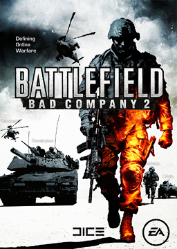
Front Cover
How could we deconstruct game covers (for our ancillary task) and not mention this classic? Here we see a soldier walking in an unusual manner toward the camera/reader. His left hand is closed in a fist, and his right is carrying his rifle. As certain as we are that most people in the military carry their weapons with both hands, (combat readiness and all that) we've never actually seen soldiers in these kind of situations. So we'll have to defer to the developer's judgement on that one. What's most notable about this cover is the colour scheme. It's a prime example of the blue/orange contrast that is so very common in game marketing these days. The reason for it is unexplained, there doesn't seem to be a source for the orange sections of the cover, the soldier's thigh emits orange, the rest of the world maintains a cold steel blue effect. If the orange was focussed on an individual, the meaning could easily be interpreted as the focus of the orange bringing light to the cold blue world. Or the contrast could be there to signify the orange focus' difference from the rest of the world. Perhaps in this case however, the orange represents blood, and it's shown as orange to express that it is like fire, igniting passion in wartime. From the soldier's stance, we can assume that he is angry about something, and the positioning of the tanks and the soldier behind him indicates that they are on his side. The soldier is also slightly off to the left, rather than being centred. We also have the standard logo of the developing company and publishing company.

Back Cover
Pretty standard layout and content with the back of the cover, a few screenshots/artwork, little paragraphs describing game features, hardware specs required to run the game, and legal wordery. In addition to all of those things, it also has an endorsement from Game Informer at the top, an age rating, and more company logos. The background is a continuation of the image from the front of the cover, with the cold blue-grey sky.
Every game with a cover follows this design, with the intent that a possible consumer of the game will turn the game case over to read more into it, and be greeted by an endorsement and pictures that the marketing department believe will sell the game. Below the parts intended to sell the game, there is a lot of text that is very useful in dissuading people who might complain about the game. It's kind of a "legal backdoor", the consumer is told right then and there on the back of the case what they're getting in to. Although it may seem innocent enough, this "fine print" is added to the cases to shift the responsibility of anything to do with the game to the consumer. It notes that a subscription is required for online play, which you wouldn't assume if you were unfamiliar with Xbox things. Xbox Live is after all, the only popular online service which charges it's customers a subscription fee for playing games that they've already bought, across the internet.

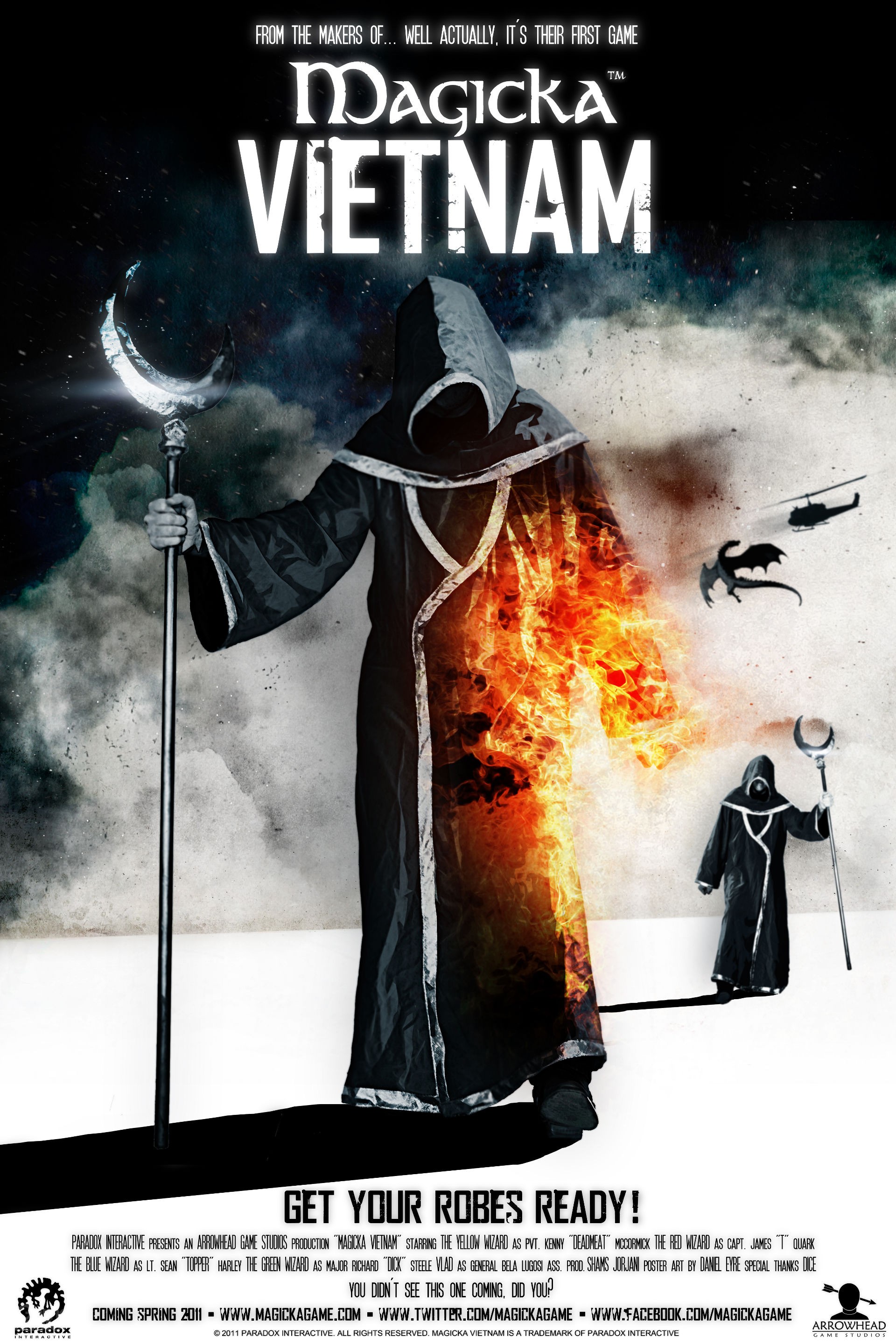
Parody Cover
The team behind the absolutely brilliant game 'Magicka', parodied the Battlefield: Bad Company 2 game cover in their poster/cover for the 'Vietnam' DLC (DownLoadable Content) for Magicka. The DLC adds a new campaign into the game, in which the player fights goblins dressed as Vietcong soldiers (in an effort to rescue someone or something, I wouldn't know since I've never got that far). The poster features a wizard/mage, the icon of Magicka, walking in a similar manner to the soldier from the Battlefield: Bad Company 2 cover.
Another good deconstruction - again though you need to somewhere state what inspiration you are taking from this product that you can use on your own - has analysing the back cover helped with the design of your own product?
ReplyDelete